A few points about usability and UI

Development feedback on user interface, features and general design.

Moderator: Kyete

stefanstr
Posts: 108
Joined: Sat Nov 15, 2014 5:25 pm

A few points about usability and UI

Post by stefanstr » Fri Sep 25, 2015 4:18 am

I feel a little weird being the top poster but oh well.

The reason I decided to back OWM is the promised simplicity of use. Autofractalization, following shapes, stuff like that. Now that I’ve been using it for a few days, I think that the ease of use could be improved in a few areas. Please treat this post as an invitation to a discussion. (Hopefully, some other backers will chip in, as well.)

1) I hate the fact that the toolbox doesn’t have a fixed position. I know it is what Photoshop and GIMP and others do, but is it really necessary? We have plenty of room in the toolbar at the top. Why not have the tools find a new home there? I hate how the toolbox seems to always get in the way of my work.

2) Why are the tooltips displayed in the status bar at the bottom of the screen and not as popups? It took me a good while to figure out there even were tooltips in OWM. Why not use a well established standard?

4) I feel that the property selectors are too cluttered. This is the big one for me, so I’ll dedicate the rest of the post to them.

First a compliment: It took me a while to get how it works, but I like the way you can rearrange and fix the position of the property windows. Very slick.

Now on to the things I like a little less.

As I said, property windows have a lot of options and feel cluttered. Most of the time, I don’t want to create a new color set for every item I add. On most maps, I will have some presets I will use over and over. I want all my rivers to use the same style. I want my forests to look consistent. Etc.

What that means is, I think that what you should expose are a palette of “sensible defaults” for item and canvas properties, where you could also save your own schemes. Only after double clicking on a palette item would a window with options to change color, etc., open. Think something like the effects on the left in this picture:

Image

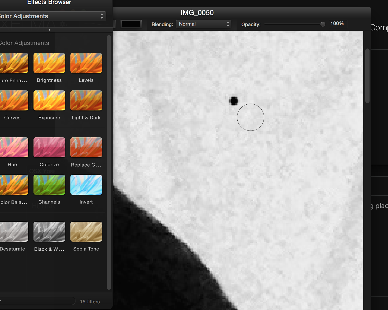
Or like this palette:
Image

You would have to open a new "color" to drill down to options. You could also save new settings to that palette. Having predefined object types would open the room for batch operations - e.g., I could use the region tool to draw various elevations, and then change the style of all the elevations of the same type at once. (It *kinda* is that way, but the detailed options are overexposed and clutter the UI which could be way more elegant.)

You could similarly have default editable “brushes” in other tools for lines, etc.

One last thing: Map properties doesn't feel to me like something that should be on the screen by default. I think this is something you should select as a part of new map creation, and would open it from the menu if you need to change it. I have never needed it after I set it up at the beginning, and it takes away screen real estate and adds to the clutter.

What do you think?

User avatar
Kanchou
Site Admin
Posts: 1023
Joined: Mon Nov 10, 2014 2:23 pm

Re: A few points about usability and UI

Post by Kanchou » Fri Sep 25, 2015 9:25 am

Stefan,

1) That's been by far the thing that I've heard the most complaints about. We left the tool bar in pre-alpha state because it's in the middle of an overhaul for adding the dungeon and city tools.
Beta 1 will let you dock it to the side like the rest of our windows. I'd like more feedback on it after Beta 1 is out to see if this works with you.

2) Actually, that's a Windows Vista and above thing and we are just "respecting" the OS settings. We'll force it to be like what we are all used to with Beta 1.

3) Where is 3? :D

4a) Map Properties
We've had internal discussions on this before that were left for later. It's a legacy thing that made sense in our pre-alpha layout.
We'll consider moving this to the map menu via a dialog.


4b) We'd like everyone's feedback on this before making any changes, so please comment!
Right now when you select the theme on program startup all this options are populated automatically to defaults. You can then easily select from presets and save your own presets for each tool, as well as exporting the whole theme.

So, is the issue mostly that detailed options are always shown when you click on the items? Or the navigation of the presets?

Let us know more! This would be a time consuming change so if we make changes we want to make sure we get it right firs try.

Thank you for all your feedback!

- Alejandro
Alejandro S. Canosa
Three Minds Software

stefanstr
Posts: 108
Joined: Sat Nov 15, 2014 5:25 pm

Re: A few points about usability and UI

Post by stefanstr » Fri Sep 25, 2015 8:01 pm

Kanchou wrote:Stefan,

1) That's been by far the thing that I've heard the most complaints about. We left the tool bar in pre-alpha state because it's in the middle of an overhaul for adding the dungeon and city tools.
Beta 1 will let you dock it to the side like the rest of our windows. I'd like more feedback on it after Beta 1 is out to see if this works with you.
Sure thing. I have a few things to say about tools in general, too, but let’s save it for another conversation.
2) Actually, that's a Windows Vista and above thing and we are just "respecting" the OS settings. We'll force it to be like what we are all used to with Beta 1.
Is it, really? I had no idea. It’s not a big deal so leave it be if it’s a lot of work. Although it was confusing to me personally.
3) Where is 3? :D
I realized at the last moment that what I was about to suggest was already in the app. I forgot to change the numbering back, though. :oops:
4a) Map Properties
We've had internal discussions on this before that were left for later. It's a legacy thing that made sense in our pre-alpha layout.
We'll consider moving this to the map menu via a dialog.
Thanks!
4b) We'd like everyone's feedback on this before making any changes, so please comment!
That’s how I feel about it, too. I am not a UI designer, so whatever I suggest might be misguided. What I do is compare OWM to my favorite software, and then think: what does that software do differently that I like. I would feel more comfortable if other people commented on my ideas.
Right now when you select the theme on program startup all this options are populated automatically to defaults. You can then easily select from presets and save your own presets for each tool, as well as exporting the whole theme.

So, is the issue mostly that detailed options are always shown when you click on the items? Or the navigation of the presets?
It’s both, actually.

Let me try and explain my thinking. Think about painting. You have your brushes, and you have your palette with various colors. You may occasionally mix the paint to create a new color, but you mainly use the ones you have on the palette. You put them there in the first place because you needed them. The process is simple. You choose a brush, you dip it in your chosen color, you paint. This is how I feel it should be with OWM, as well.

Let’s imagine for a moment that Map Properties have been removed and the whole right side of the screen is dedicated to Item Properties. And let’s try and replicate my palette analogy there. You would choose your “brush” (i.e., your tool, let’s say: landmass). The whole right side of the screen would show you the various “colors”, i.e., your item presets. It could be as rectangles (as it is now) or as circles. I.e, what now is hidden under the dropdown would be displayed along the whole right side of the screen. And it would be the only thing on display. (The options like name, style fill, texture, etc., wouldn’t be there, at all.) If I wanted to select another preset, it would be one click away, and also in plain sight, so I would know exactly what I have at my disposal.If I wanted to modify a preset or to create a new one, I would double click on an existing preset or click on a “plus sign” at the bottom and it would open a new window with the options we currently see under Item Properties. It would be like “mixing in” a new color.

The way it is displayed now seems to suggest that you are supposed to play with the options (or “mix in new colors”) all the time. It doesn’t help you to quickly select one of the presets, which is what you actually wanna do most of the time.
Let us know more! This would be a time consuming change so if we make changes we want to make sure we get it right firs try.
I am well aware how involved this change would be. Please let me know if anything is unclear in my post. I really want to make sure we understand each other perfectly before you even start thinking about redoing such a big chunk of code...

User avatar
Kanchou
Site Admin
Posts: 1023
Joined: Mon Nov 10, 2014 2:23 pm

Re: A few points about usability and UI

Post by Kanchou » Fri Sep 25, 2015 9:20 pm

stefanstr wrote: Also, speaking of palettes: I feel that what currently is called “Palette” should be a tool instead. “Object Tool” or something. And the Feature Sets and Categories should be shown where the Item Properties are being displayed now - and only if I have selected that specific tool. I can’t think of any situation where I would need to see Item Properties and objects from the Palette at the same time... And it would give us more real estate for the actual map.
Stephanie made that point and we didn't make it to finish the change by Alpha 3. You guys think alike ;P

We just had a UI update/redesign meeting. I'll make a new clean post on summarizing the changes before Monday. All these changes will be a part of Beta 1, which we hope will have a streamlined UI that will be close to the final release.

Any more UI suggestions?

Thank you all for the feedback!

- Alejandro
Alejandro S. Canosa
Three Minds Software

stefanstr
Posts: 108
Joined: Sat Nov 15, 2014 5:25 pm

Re: A few points about usability and UI

Post by stefanstr » Sat Sep 26, 2015 5:34 am

Kanchou wrote: Stephanie made that point and we didn't make it to finish the change by Alpha 3. You guys think alike ;P
We share more than a name, it seems. ;)
We just had a UI update/redesign meeting. I'll make a new clean post on summarizing the changes before Monday. All these changes will be a part of Beta 1, which we hope will have a streamlined UI that will be close to the final release.
Sounds amazing! I am sure what you guys have come up with is even better than what we suggested. Can’t wait. :)
Any more UI suggestions?
Let’s see. If Map Properties get relocated to the New Map dialog, Item Properties get revamped as per our discussion, and features/objects become a tool, (and we get the name spaces as per Casey’s excellent suggestion), the major pain-points would be dealt with for me.

Most of the thoughts which I haven’t posted yet are not on the UI level. But I have three more that might have an impact here:

1) Wouldn't it make sense to merge Select, Move and Scale into one tool? It keeps confusing me that I cannot complete the other operations without switching tools. Maybe there is a good reason to have three tools and I’m not smart enough to see it?

2) I’ve been thinking that maybe the “vector mode” aka the points tool shouldn’t be a tool but a full-blown editing mode instead. I keep trying to use the box tool to select a part of the points on landmasses to reshape them, and stuff like that. Again: it might have consequences I haven’t foreseen, but it’s how Pixelmator does it and it works pretty well. It would also solve the problem that points in the Edit Points tool are somewhat hard to select, and it's also hard to add a new point. I usually end up deselecting the path instead.


3) I think layer management could be improved upon but I have not concrete suggestions here yet, and I think it is a rather contained change so maybe it can be discussed at a later stage. Only bringing this up in case you tell me this would have to be bundled with the other UI changes, in which case I’d try and flesh out my thoughts on that.
Thank you all for the feedback!
My pleasure. It’s all self-serving, as I want OWM to be exactly what I need. :) In fact, I am surprised so many Alpha backers don’t use that unique opportunity and don’t post.

User avatar
Kanchou
Site Admin
Posts: 1023
Joined: Mon Nov 10, 2014 2:23 pm

Re: A few points about usability and UI

Post by Kanchou » Sun Sep 27, 2015 2:46 am

stefanstr wrote: 1) Wouldn't it make sense to merge Select, Move and Scale into one tool? It keeps confusing me that I cannot complete the other operations without switching tools. Maybe there is a good reason to have three tools and I’m not smart enough to see it?
We put a lot of thought/planning onto that during our pre-alpha stage and feedback.
a)A lot of people don't like the select and move to be the same tool because you may accidentally move and item when you just want to select it (for changing properties, copying, etc).
b) If you include the rotate in the same tool, you can to rotate by clicking and dragging outside the item, which makes it so that you have to have a hot key to unselect the item before you can select another one for editing (i.e. escape).
c) That leaves only the move and select being viable as the same tool, but it can be confusing since all the other tools are separate already.

What do you think?
stefanstr wrote: 2) I’ve been thinking that maybe the “vector mode” aka the points tool shouldn’t be a tool but a full-blown editing mode instead. I keep trying to use the box tool to select a part of the points on landmasses to reshape them, and stuff like that. Again: it might have consequences I haven’t foreseen, but it’s how Pixelmator does it and it works pretty well. It would also solve the problem that points in the Edit Points tool are somewhat hard to select, and it's also hard to add a new point. I usually end up deselecting the path instead.
Long term the idea is to add a box select to the three options right now in the point editing toolbar (so you'd have Move, Box Select, Add and Remove, and possibly other path options, so it's kind of going where you suggest already).
For it being hard to add new points we'll try increasing the tolerance of what's considered inside the current object selected.
stefanstr wrote: 3) I think layer management could be improved upon but I have not concrete suggestions here yet, and I think it is a rather contained change so maybe it can be discussed at a later stage. Only bringing this up in case you tell me this would have to be bundled with the other UI changes, in which case I’d try and flesh out my thoughts on that.
Layer functionality is self contained, so we could work that out later as you use the program more.
stefanstr wrote: My pleasure. It’s all self-serving, as I want OWM to be exactly what I need. :) In fact, I am surprised so many Alpha backers don’t use that unique opportunity and don’t post.
Alpha/early beta feedback can really shape a program!

We're going to consolidate all our plans for the UI update into one post like I said, but may be later in the week. We are waiting for feedback from additional people who are reviewing OWM that are cartographers and gamers, then we'll put all the ideas together for you guys to review :)

Thanks again!

- Alejandro
Alejandro S. Canosa
Three Minds Software

stefanstr
Posts: 108
Joined: Sat Nov 15, 2014 5:25 pm

Re: A few points about usability and UI

Post by stefanstr » Sun Sep 27, 2015 7:48 pm

Kanchou wrote: We put a lot of thought/planning onto that during our pre-alpha stage and feedback.
a)A lot of people don't like the select and move to be the same tool because you may accidentally move and item when you just want to select it (for changing properties, copying, etc).
b) If you include the rotate in the same tool, you can to rotate by clicking and dragging outside the item, which makes it so that you have to have a hot key to unselect the item before you can select another one for editing (i.e. escape).
c) That leaves only the move and select being viable as the same tool, but it can be confusing since all the other tools are separate already.

What do you think?
Re a) This is a valid point. I never thought of that.
Re b) I agree that rotate has to be a separate tool.
Re c) It’s not only move and select, but also scale that could be integrated in my opinion. It is how you usually work with windows... Maybe simply add an additional tool “manipulate” or whatever that includes all of select, move and scale. People like me will be able to use that one, and whoever prefers the other tools, will use them... Or... is there anyone who complains about move and scale being integrated? If not, you could have two tools. “Select only” for people from your point a) and “Select+move+scale” for general use.

What do you think?
Long term the idea is to add a box select to the three options right now in the point editing toolbar (so you'd have Move, Box Select, Add and Remove, and possibly other path options, so it's kind of going where you suggest already).
Great!
For it being hard to add new points we'll try increasing the tolerance of what's considered inside the current object selected.
Please do! It’s not only (or not even mainly) about adding new points. I find it hard to select existing points, too.
Layer functionality is self contained, so we could work that out later as you use the program more.
Agreed.
We're going to consolidate all our plans for the UI update into one post like I said, but may be later in the week. We are waiting for feedback from additional people who are reviewing OWM that are cartographers and gamers, then we'll put all the ideas together for you guys to review :)
Awesome! I will feel much safer in knowing that actual professional users have evaluated my suggestions. Can’t wait to see the end result. 8-)

stefanstr
Posts: 108
Joined: Sat Nov 15, 2014 5:25 pm

Re: A few points about usability and UI

Post by stefanstr » Mon Sep 28, 2015 2:12 am

stefanstr wrote:
Kanchou wrote: We put a lot of thought/planning onto that during our pre-alpha stage and feedback.
a)A lot of people don't like the select and move to be the same tool because you may accidentally move and item when you just want to select it (for changing properties, copying, etc).
b) If you include the rotate in the same tool, you can to rotate by clicking and dragging outside the item, which makes it so that you have to have a hot key to unselect the item before you can select another one for editing (i.e. escape).
c) That leaves only the move and select being viable as the same tool, but it can be confusing since all the other tools are separate already.

What do you think?
Re a) This is a valid point. I never thought of that.
Re b) I agree that rotate has to be a separate tool.
Re c) It’s not only move and select, but also scale that could be integrated in my opinion. It is how you usually work with windows... Maybe simply add an additional tool “manipulate” or whatever that includes all of select, move and scale. People like me will be able to use that one, and whoever prefers the other tools, will use them... Or... is there anyone who complains about move and scale being integrated? If not, you could have two tools. “Select only” for people from your point a) and “Select+move+scale” for general use.

What do you think?
When I was writing this yesterday, I wasn't actually at my girlfriend's Windows computer so I wasn't able to use other world mapper. I check now, and it turns out you can select objects with other tools so I guess what I'm really asking is do you really need a separate move and scale tool. You convinced me that having a separate select tool is advantageous. And I don't think all this is such big a deal. Feel free to leave the tools as they are now and ignore my pedantry.

User avatar
Kanchou
Site Admin
Posts: 1023
Joined: Mon Nov 10, 2014 2:23 pm

Re: A few points about usability and UI

Post by Kanchou » Thu Oct 01, 2015 6:50 pm

stefanstr wrote: When I was writing this yesterday, I wasn't actually at my girlfriend's Windows computer so I wasn't able to use other world mapper. I check now, and it turns out you can select objects with other tools so I guess what I'm really asking is do you really need a separate move and scale tool. You convinced me that having a separate select tool is advantageous. And I don't think all this is such big a deal. Feel free to leave the tools as they are now and ignore my pedantry.
Not pedantry at all. This is very useful to us and we've had these discussions internally before. The select + box select and the move + scale are tools that we've been back and forth on whether they should be combined, and adding a "free transform" tool (even if it's via the edit menu) is a good idea.

- Alejandro
Alejandro S. Canosa
Three Minds Software

stefanstr
Posts: 108
Joined: Sat Nov 15, 2014 5:25 pm

Re: A few points about usability and UI

Post by stefanstr » Sun Oct 11, 2015 2:02 pm

Kanchou wrote: We're going to consolidate all our plans for the UI update into one post like I said, but may be later in the week. We are waiting for feedback from additional people who are reviewing OWM that are cartographers and gamers, then we'll put all the ideas together for you guys to review :)
Any news on that front? No pressure, I am just curious. :)

Post Reply